Friday, June 29, 2012

What watercolor paint should you use for pouring?

"Magnolia Scepters" by Starr Weems. 15x22
The layers in a poured painting are both unified and complex, like the flavors in a fine wine. This effect is due to transparent glazes.


Ok, so you want to start pouring. What kind of paint do you need? That’s what everyone asks me.

Well, you want to have at least three tubes: the primary colors. Which primaries you should choose is a whole ‘nother post, because there are really more than just the three that you were taught about as a kid. (I know, I know. First the brontosaurus and now this. Your childhood was a lie.)

Let’s assume you have the color thing under control. What kind of paint do you need? There are lots of factors to consider and I will get to those. What I’d like to focus on today is transparency.

In general, I'm not a watercolor snob. I don't sniff condescendingly when I see a tube of china white in another artist's paint box or (gasp!) ivory black. Someone uses gouache to "cheat" on highlights. So what? If the final product is nice, then who cares?  But... When it comes to pouring layers, paint type is very, very important. It’s gotta be transparent.

Why is transparency so crucial for pouring? Because your colors are mixing right there on the paper, not on a palette. Think of it like this:

You are stacking sheets of colored glass on white paper. You lay down a sheet of yellow and then a sheet of blue on top of that. The light travels through the layers of transparent glass, bounces off of the white paper and delivers a vibrant green color to your eye.

What if you replace the transparent blue sheet of glass with translucent, milky glass? Or what if one of the glass sheets is dirty? How does that change what you see? You still might get green, but there is no brilliant clarity.

If you pour 6 layers of paint, but one of those paints is even just semi-transparent instead of totally transparent, then with each pour, the light is hindered just a little as it travels through the layers. You don’t want that! You want deep, clear, shining color, not a murky puddle.

So how do you know if the paint is transparent? Most manufacturers have a chart. Sometimes it is marked right on the tube, which is nice.

If you have a tube of paint that you are not sure about, you can test the transparency yourself by drawing a line with a Sharpie. Paint over the line with different colors.  If it really is a transparent color, the black line will look the same as it did before you put paint on it. If the color covers the line at all, it's more opaque. You will see that there are varying degrees of transparency.

So, when you are choosing paint for pouring, make sure that each color is transparent. We will look at some of the other paint considerations later.

In the meantime, if you have questions, Facebook me, contact me by email or comment below.

Wednesday, June 27, 2012

Dreams


"In the Forest of the Night" by Starr Weems. 10x13.5. Watercolor on 140 pound paper. 

My art is often described as "dreamlike," so it seems appropriate that dream translator Meredith Smith, author of the forthcoming book "Dreamworkers" (release date August 2012) has asked me to work with her on some upcoming illustration projects. Check out Meredith's blog post on our collaboration. To learn more about Meredith, visit her site at ispeakindreams.com.

To see more of my work, visit my website at www.StarrWeems.com, connect with me on Facebook or email me.


Thursday, June 21, 2012

Album Art Part Two

Last week, I showed you the process of creating the cover for Mary Crowell's new album (see it here). The project was a success! Read her blog post about our collaboration here. This week, I have been working on the art for the back cover. 

"Rupus Fugue" by Starr Weems. 15x15 Watercolor on 140 lb .paper. 


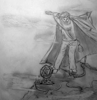
The image is based on one of Mary's songs and portrays Rupus Fugue, a crazy seer. My mission: To create a man with ragged clothing and a green cape swinging an electric guitar like a golf club to hit a giant D20 that is being upheld by a kobold on a misty mountain top. A serpentine dragon is visible in the distance. A purple dice bag and a crow are bonus items. 

Step one: Research and Sketch Ideas

I looked at lots of pictures of dice, capes, guitars and golf swings. A former student of mine was nice enough to video himself swinging an electric guitar like a golf club. I want to know what his neighbors thought. 

Step two: Choose a Thumbnail to Develop

I start with this guy... 


And revise...

And revise more...

Step Three: Enlarge and Transfer

I transfer the image to my paper. 

Step Four: Apply Drawing Gum and Pour the Layers


I Mask out the brightest lights with the drawing gum. 

Pour and lift layer one..

Pour and lift layer two...


Pour and lift layer three...


Step Five: Start all Over Again

Yep, really. Start all over. I decided that Rupus and the sky were too close in value. It just wasn't working. Getting the values right when pouring is the most important thing. You can't fix it with color. That's like trying to fix a problem with the proportions of a pencil drawing with some really great shading. Back to the drawing board. I do everything I just did all over again, changing a few things. 

Step Six: Remove Drawing Gum and Scrub

I remove the masking with a special tool and then lift paint out with a scrubber and a sponge. 

Step Seven: Direct Paint


I add details with direct paint. I'm finished! Mary's son said I rolled a natural 20 on my art check. Making geeky art is fun work. :) 

Questions? Contact me or leave a comment below. To see more step-by-step photos of how paintings like this one are created, see Start to Finish: Pouring Watercolor. You can also connect with me on Facebook to see my latest work. 


Sunday, June 17, 2012

Creating Album Art


Album art by Starr Weems for Mary Crowell
"Acolytes of the Machine" Starr Weems. 15x15 Transparent watercolor on 140 lb. paper. 

I was excited when Mary Crowell commissioned me to do the cover work for her new gaming-inspired solo album. It isn't often that I work with a client who has such a clear vision of what she wants for the final product. What did Mary want for her cover? An ornate, fantasy organ with multiple ranks of pipes, a dark-haired organist with her face reflected in a mirror and creepy stone children singing, all with a slight steampunk feel. Here is the process I went through to get to the image above. 

Step one: Research and sketch ideas
The first part of my research is to read the lyrics to the song that goes along with the image. I want to make sure that I understand the feel of the piece. I don't remember what a pipe organ looks like, so I also spend lots of time looking at pictures of different styles. I sketch out thumbnails of possible painting compositions. 

Step two: Develop one of the thumbnails
I choose the thumbnail I like the best and develop it into a preliminary sketch. 

I send the sketch to Mary for review. She confirms that we are headed in the right direction and has some suggestions on changes she would like. 

Step three: Revise the sketch

I spend some time playing with the images and moving some things around. I send it back to Mary. Ding, ding, ding! We have a winner. 

Step four: Create a clean sketch for paper transfer

I start from scratch on a new sheet of paper and redraw the image, making minor adjustments and leaving out any shading. This is the image that I will use to transfer to the watercolor paper. I go to Staples and have this picture enlarged from 9x9 to 15x15.


Step five: Create a value sketch

With watercolor pouring, it is especially important to have the value placement mapped out in advance. I complete a value sketch so that I know exactly where to paint the drawing gum. 

Preliminary sketch for "Acolytes of the Machine."  Starr Weems

Step six: Correct an unforeseen problem

With the value sketch complete, a problem with the design becomes apparent. I want the organist and the background to appear as two separate but related images. This way, I can capture both the looming quality of the ranks of pipes and the detail of the console. The adjustments that I made to the preliminary sketch have made the organist and pipe ranks too cohesive. I need some way to separate the console and the background. 


I put a piece of tracing paper over the value sketch and try different solutions. Adding a cloud of steam around the organist seems to work the best. I show the addition to Mary and she adds that she would like for the steam to be thin and wispy so that it does not obscure the creepy, glowy-eyed children. 

Step seven:  Transfer the image
I transfer the image to the watercolor paper using a graphite transfer sheet.


The copy that I am tracing from is very low quality because Staples ran it off on their blueprint machine, but I have the value sketch to reference. 

Step eight: First pour
I mask the brightest values with drawing gum and pour the first layer!


To make sure that the steam is wispy, I decide to use a paper towel to lift out the color on each layer that I pour. 


Now I set it aside to dry for a few hours.

Step nine: Second pour
Following my value sketch, I mask out the next lightest values with the drawing gum. 


I am ready to pour the second layer. 


I get impatient this time and dry the painting with a hair dryer so that I can get another pour in before the day is over. 

Step ten: Third pour

I mask the next lightest value with the drawing gum. 


And pour...


I let it dry. I think one more layer will do the trick. 

Step eleven: Fourth pour

I mask and pour the final layer.


I really, really want to be impatient and remove the masking to see what my picture is looking like underneath, but I wait because I know I will be heartbroken if I jump the gun and rip the paper. 

Step twelve: Remove drawing gum
Finally! The piece is dry and I get to remove the drawing gum with a special eraser. 


Now I can see what I have to work with. 


The lines are rough and there are no details painted in yet. 

Step thirteen: Scrub
I use a scrubber brush and a melamine sponge to soften the lines and move some of the paint around. 


Now I have all of the scrubbing finished and the piece is ready for some direct paint. 


Step fourteen: Add detail with direct paint
I add some detail...


And more...


And more...


I'm finished! I send the image to Mary for review and she loves it. Now I am all set to work on the back cover of the album. 

Questions? Contact me or leave a comment below. To see more step-by-step photos of how paintings like this one are created, see Start to Finish: Pouring Watercolor. You can also connect with me on Facebook to see my latest work. 

Wednesday, June 6, 2012

Summer Magic


"Summer Magic" by Starr Weems. 20x26 Transparent watercolor on 140 lb. European-milled, cotton rag paper. 

If you are interested in commissioning or purchasing a piece of art, contact me. To see step-by-step photos of how paintings like this one are created, see Start to Finish: Pouring Watercolor

Tuesday, June 5, 2012

Summer Sparkle


"Summer Sparkle" by Starr Weems. 20x26 Transparent watercolor on 140 lb. European-milled, cotton rag paper. 

Don't you love that time of day when the sky is golden and the fireflies are just beginning to glitter in the shadows? This painting is my way of stopping time so that I can enjoy summer dusk at any time of year. 

If you are interested in commissioning or purchasing a piece of art, contact me. To see step-by-step photos of how paintings like this one are created, see Start to Finish: Pouring Watercolor