Monday, February 25, 2013

Steps to Creating a Poured Watercolor Portrait


"Samantha Grace" Transparent watercolor on 140. lb European-milled, cotton rag paper. 12x18

This beautiful baby portrait was commissioned by the little girl's grandmother. The following photographs show the watercolor pouring process that I used to complete the work. 


First, I sketch my image in graphite and then use drawing gum to mask out the parts that I want to leave white. 


Next, I mix up paint, wet the paper, pipe the paint on to the paper with a pipette and let the excess paint run off the bottom left corner. 


Once completely dry, I brush on another layer of drawing gum in the areas that I want to keep light. 


Then I pipe on another layer of paint. 


Once that layer is totally dry, then I add more drawing gum to the areas I want to maintain. 


Then I pipe on another layer of paint...


Next, I add even more drawing gum and pipe on another layer of paint. 


This is what it looks like when all layers have been poured and the drawing gum is ready to be peeled off to reveal the painting underneath. 


I use a rubber cement pick up to remove the drawing gum


The layers underneath are revealed and now I know what I'm working with. 


I use my scrubber brush to soften lines and move paint around.


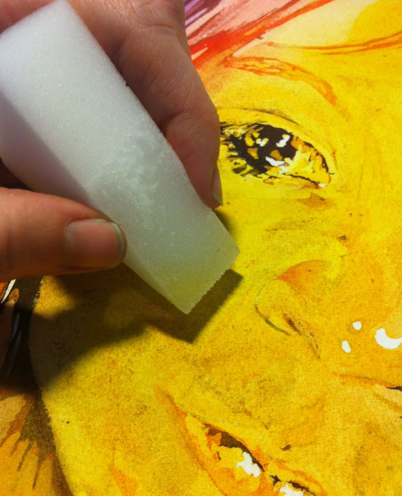
I used staining paint this time, so the scrubber isn't cutting it. I have to pull out the big gun: a Mr. Clean Eraser. 


Now I'm getting somewhere with the scrubbing. Time to start adding details.


Sometimes instead of mixing up paint, I use a scrubber to activate the paint that is already on the paper and then use that as a well to pull from. I dip a brush into the activated paint and use that to create details on other parts of the image. 


I continue to add details until I am satisfied.


Finally, the finished product! Meet Samantha Grace. Leave a comment and tell me what you think. 

Do you want to own a poured watercolor of your own? Contact me

Questions on how much a watercolor like this is worth?   See here

Wondering how long it takes to create one of these pieces? This post explains


Would you like to see more step by step examples? Check out these posts:


Thursday, February 21, 2013

Ten and Not Nine: Step-by-Step Watercolor Pouring


"Ten and Not Nine" Watercolor on 140 lb. paper. 15x22


To create "Ten and Not Nine," I first sketched out my design on 140 lb. Kilamanjaro paper and used drawing gum to mask out the areas that I wanted to leave white. 


Next, I mix up some paint. I pour with primaries only. I usually try to stick with transparent watercolors that are made with a single pigment. 


I wet my paper and squirt paint on with a pipette. This is my first pour. The drawing gum protects the paper from the paint and makes sure that those parts remain white. 


I decide that I want a little bit of texture in this piece to give the light an energetic feel. Yeah, that is holiday tinsel I'm using for the texture. Don't judge. 


I pile some books on top of the tinsel to hold it down while the paint dries. That will help it texture the image a little bit more. 


Once dry, I remove the books. This is what it looks like.


The tinsel leaves a pattern that reminds me slightly of something you might see under a microscope. That inspires me to try out some more texture methods with my students. Ooh! Side project:


Now that the side project is finished, it's back to work on "Ten and Not Nine." I add more drawing gum. This time, I am masking out the second to lightest value. Remember, the first layer protected the parts that I wanted to remain white. These parts are light, but not white. 


I didn't show the part where I pipe on another layer of paint and put tinsel on top of it, but I did it. This is what the second layer looks like once dried.  


And the third layer...


And the fourth layer...


All of the masking and pouring is finished at this point! This is where I start to wonder what my painting looks like underneath all of that drawing gum. 


So I use a rubber cement pick up to start taking the drawing gum off...


And I get to see how the layers underneath the drawing gum look...


Once I remove the drawing gum, I assess the situation. In general, I'm happy with it, but I definitely want to soften some lines and unify the color a bit. 


I wet a scrubber brush and start moving paint around. 


Getting closer...


I continue to scrub, but it becomes apparent that I am not going to get the color unity that I want just from scrubbing. I must do something more drastic. 


I wet down the hair with my sprayer and pour a layer of yellow paint over the hair. 


Yep, that's better! My work here is finished. 


Are you wondering how long a painting like this takes? See How Long Does it Take to Create a Watercolor Painting? 
Want to see more about how the pouring method works? See Start to Finish: Pouring Watercolor.

If you want to commission a painting, contact me by email at starrwd@gmail.com or visit my website at www.StarrWeems.com. Be sure to connect with me on Facebook.

Tuesday, February 19, 2013

Anamorphic Art: Sevilla Nights


The first time I ever saw an anamorphic design was as a teenager. I had wandered into Espace Dali in Montmartre where I saw a huddle of people chattering in a language I didn't understand, looking down at a painting lying flat on the table. Someone set a cylindrical mirror down on top of the image and suddenly the picture completely changed. It made my brain hurt a little, but I was intrigued.

While anamorphic images seem like something Dali would have invented, they have a history in art that goes back waaaay farther than that. Folks like Holbein and even da Vinci were known to incorporate anamorphic images in their art.

Today, when I was putting a lesson together for my students, I decided to try my hand at creating an anamorphic image of my own. Being without a cylindrical mirror, I used my Thermos cup as a reflective surface. The image that I used was based on "Sevilla Nights," a painting of mine that was used last spring as the cover art for Valley Planet.

First, I spent some time just playing around with looking at the reflection in the cup while drawing.


To see more of my work, connect with me on Facebook or visit my website at www.StarrWeems.com. 


Wednesday, February 13, 2013

Inspired by the Classics: Monoprint Layering in Watercolor


"Early Spring" by Starr Weems. Transparent watercolor on 140 lb. Kilamanjaro paper. 22x15


"Sun Storm" by Starr Weems. Transparent watercolor on 140 lb. Kilamanjaro paper. 22x15

As I was creating some art history lesson plans for my students last week, I came back across the work of Joseph Mallord William Turner. I love the shapes and value patterns in his paintings, but I don't particularly identify with the subject matter or enjoy the color. I began to ponder what might happen if I created a series based on the intriguing shapes that underlie Turner's seascapes. I would use colors, textures and topics that feel more accessible to me. 

Inspired by a bag of leaves, seed pods and moss that my children and I collected on a hike during an unseasonably warm winter day, I decided that I would experiment with a technique which combines my standard layering of transparent colors with a monoprinting process. 

First, I chose two paintings by J.M.W. Turner that had movement that I liked.
 This one is "Snow Storm: Hannibal Crossing the Alps." I like the swooshing feel of the storm on this one.
This one is called, "Snow Storm: Steam Boat off a Harbor's Mouth Making Signals in Shallow Water." Whew. That's a long title. 

Once I settled on these two paintings as inspiration, I looked at them for a long time and decided which shapes I'd like to keep and which parts I would need to change in order to fit my vision. I made value sketches to help me plan out how many pours I might need to get the value range that I wanted. I decided on about 6. 


These were my value sketches. You can already see that I changed the design quite a bit, but the overall shape of the paintings is still there. I did the color planning in my head. 


Now that I have a plan, I add a layer of drawing gum to the places that I want to leave white, wet my watercolor paper with a spray bottle and pipe on paint. 


While the paint is still wet, it's time to experiment with the printing techniques! I am not quite sure what to expect, so I try lots of different things. I lay out moss, leaves, seed pods and grasses on top of the wet paint and I weight them with geodes that we collected from the creek. I leave them like that for about 12 hours. 


After 12 hours, I remove the leaves and examine the textures. The seed pods and leaves worked great, but the moss didn't texture my paper as much as I wanted. I toyed with the idea of simulating the texture with terrycloth, but I just could not stand the thought of deviating from my plan to use only items from nature for the texture. I masked out my second value layer with drawing gum, poured paint and arranged the leaves and rocks again.


I repeated this process 4 or 5 times. Each time, I would follow my value sketch and mask out another layer with the drawing gum before carefully planning where to place each texture piece for the printing stage. 


Woohoo! The watercolor paintings are now all ready for the drawing gum to be peeled away with a rubber cement pick up eraser! 


After removing the drawing gum, I take a look at each picture next to its inspiration piece. 


I feel like I accomplished my goal of reinterpreting the pieces to fit my own ideas. Normally, I would take a scrubber brush and start smoothing out hard lines and adding additional details, but I decide to leave these alone for now. When I come back to them in a few days, I can see if there is something I'd like to change.

If you are interested in commissioning a piece of art, contact me. Visit my website at www.StarrWeems.com or find me on Facebook to see more work.